Color can make your home feel calmer, more focused, or more welcoming, but the effect depends on light, room size, and the colors around it. Start with muted greens for restoration, warm neutrals for ease, and deeper accents for definition. Test each shade through the day before you commit; the same paint can shift from restful to stark as the light changes.
See How Color Changes a Room’s Mood
Color changes more than a room’s appearance—it can shape how you feel and use the space. Notice how a bright wall can energize your morning, while a muted shade may help you unwind at night. These effects depend on more than hue: natural light, room size, finish, and nearby colors all influence what you perceive. A deep tone might feel intimate in a well-lit den but heavy in a small, dim hallway.
Pay attention to mood milestones throughout your day. Where do you need focus, conversation, rest, or a smoother transition between activities? Use calm contrasts to give a room definition without making it feel busy; for example, pair a soft wall color with darker trim. Test samples in changing light before committing, and judge them alongside your furnishings.
Choose a Home Palette With Color Psychology
How do you want your home to feel from room to room? Start with a palette that supports your daily rhythms, not a trend you’ll tire of quickly. Use color theory to connect shades through shared undertones, then vary their intensity to create movement without visual clutter. Color psychology offers useful cues: muted greens may feel restorative, while warm hues can add energy, but personal associations matter too.
Test samples on different walls and observe lighting effects throughout the day; daylight and evening bulbs can shift a color’s appearance. Decide where neutrals vs. bolds will best serve your priorities. A restrained base can make richer accents feel intentional, while a more saturated palette may suit you if you enjoy strong visual impact. Repeat a few colors across rooms to create continuity, and adjust as your needs change.
Pick Living Room and Kitchen Colors
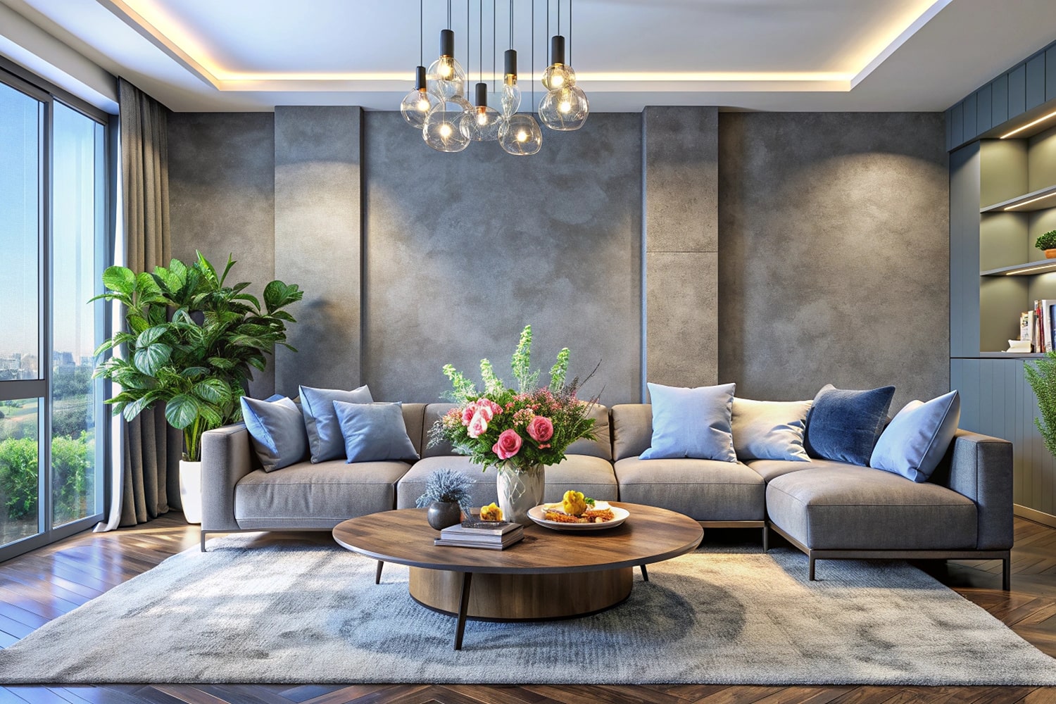
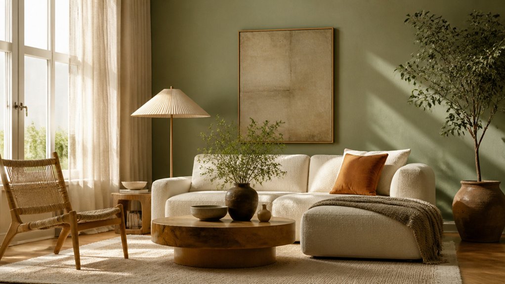
In the living room, choose colors that support how you relax and gather: soft, grounded hues can feel restful, while deeper accents add definition. Calm neutrals on walls and larger furnishings give you flexibility as your needs or tastes change. Add bold accents through cushions, art, or a single painted feature, then check how they look in daylight and evening light.
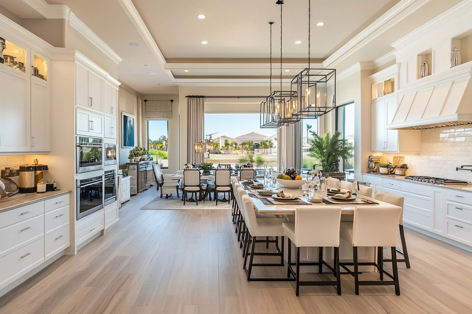
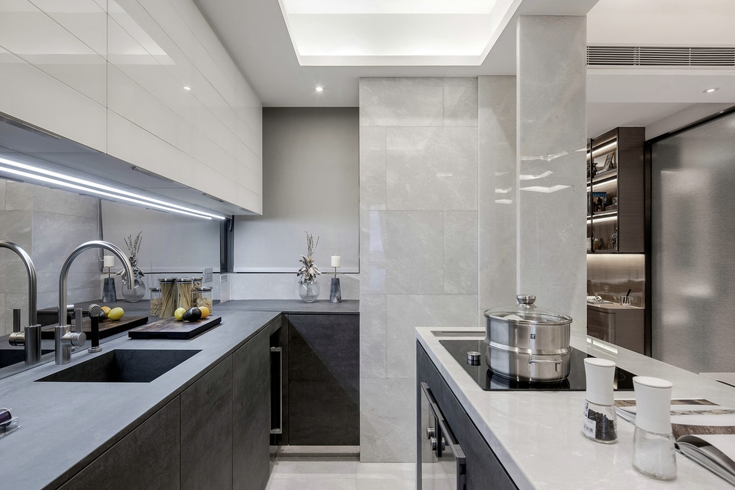
In the kitchen, consider both atmosphere and upkeep. Warm whites, muted greens, or earthy tones can make the room feel welcoming without overwhelming a busy space. If your cabinets or counters already have strong color or pattern, keep surrounding surfaces quieter. For an open-plan home, repeat one shade from the living room in the kitchen to create flow, but vary its intensity so each area retains its own character.
Create Calm Bedroom and Bathroom Palettes
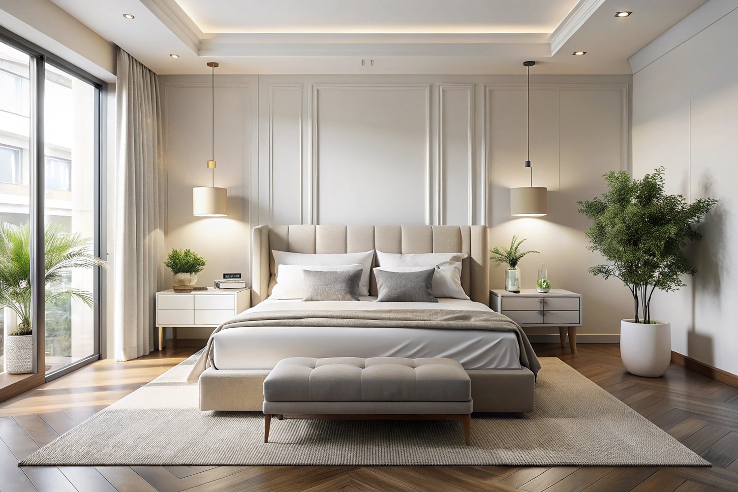
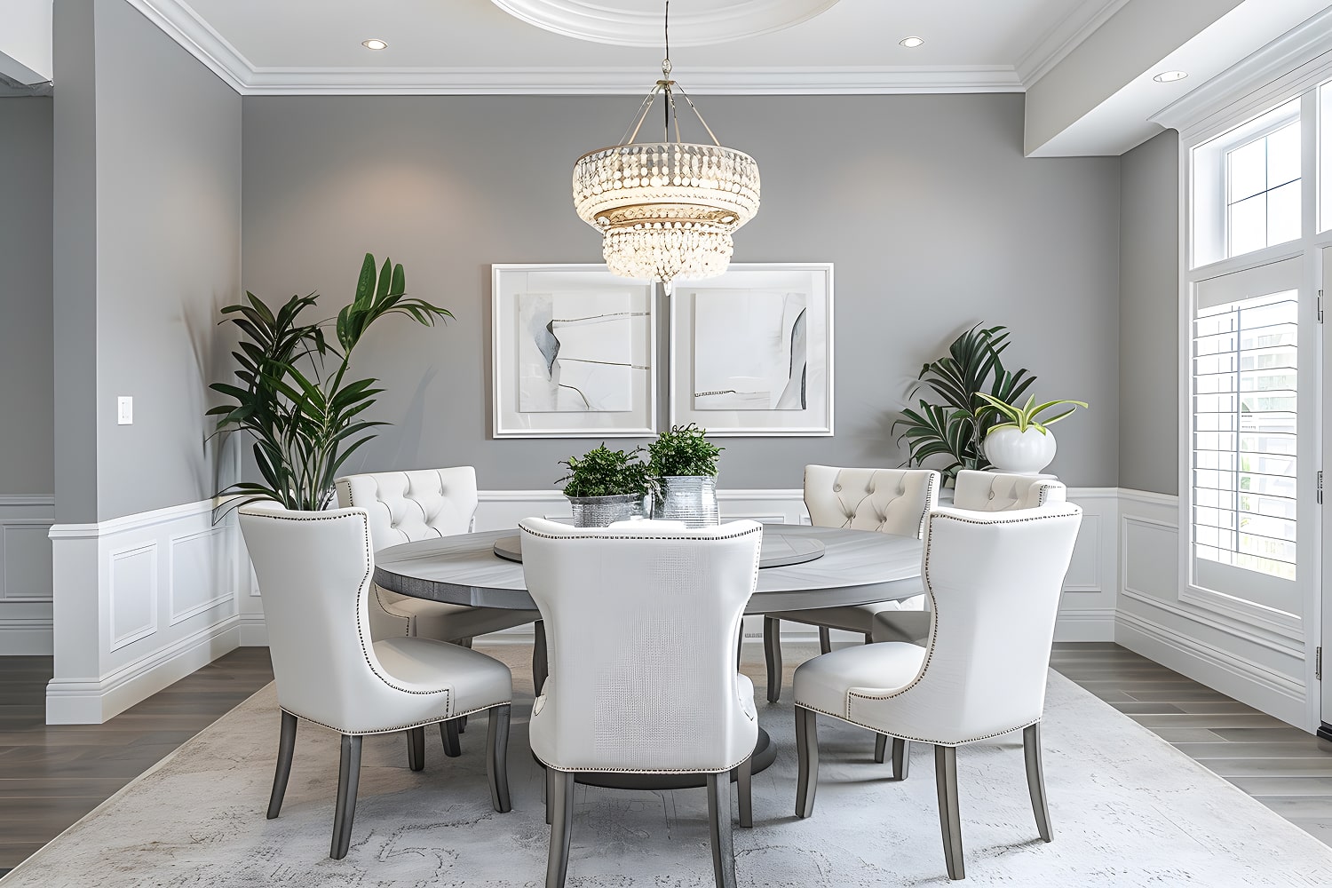
Bedrooms and bathrooms benefit from palettes that feel restful without becoming flat. In a bedroom, use calming neutrals—warm white, muted taupe, or gentle sage—as a quiet foundation. Add depth with soft textiles in varied weaves, then choose one or two contrasting accents, such as a deep blue cushion or a dark wood frame. Keep the strongest hues away from large surfaces so your room stays easy to unwind in.
In a bathroom, repeat a bedroom color for continuity, but account for changing light and daily moisture. Choose moisture friendly finishes that handle damp conditions, and balance cool tile with warmer paint, wood, or towels. A restrained accent shade can define a vanity or niche without making a compact space feel busy. Let texture and material variation provide interest; you don’t need bold color everywhere to create character.
Test Home Paint Colors Before You Commit
Before settling on a paint color, see how it behaves in your home’s changing light. Buy sample pots and paint large swatches on several walls, or use movable boards you can reposition. Small chips won’t reveal how a shade shifts beside flooring, trim, furniture, or your existing palette.
Observe each sample in morning, afternoon, and evening light, with lamps on and off. Note whether the color looks warmer, cooler, brighter, or duller than you expected. Your test palettes should include a few related shades, not a dozen near-identical options; clear comparisons make decisions easier.
Use mood testing, too: spend time in the room and notice how each option affects its feel. A color that looks appealing online may feel too intense at home. Live with samples for several days before committing.